Designing Personalization Features for the Coursera Mobile App
My Role: Lead UX Researcher, Project Manager | Project Duration: 2 weeks

Introduction & Challenge
Methods of learning and education are rapidly evolving thanks to technology and the need to adapt to a global pandemic. Digital classrooms are the answer to social distancing—but they also are a means to accessible and flexible education. Whether it is someone looking to further their education or switch careers entirely, Coursera has a wide range of courses with customizable pricing and learning plans.
As part of my own education with General Assembly, I was asked to do a UX sprint for Coursera’s mobile app with the goal of designing a new feature and redesigning an existing one. I took the role of lead UX researcher while also project managing the sprint to keep us on track of our deliverables. As should all UX design, we began with the research.
Research
Coursera Today
Before beginning any external research, I first wanted to learn more about Coursera’s offerings and their own approach to education. I found this quote on Coursera’s website that gave me a quick peek behind the curtain:
Coursera partners with more than 200 leading universities and companies to bring flexible, affordable, job-relevant online learning to individuals and organizations worldwide. We offer a range of learning opportunities—from hands-on projects and courses to job-ready certificates and degree programs.
I picked out the features most important to Coursera: flexible, affordable, and job-relevant. Their diversity of courses was also important to the company.
I have never used the Coursera mobile app, so I decided to download it and research some of the typical paths I hypothesize users take on it. The key flow to me was course discovery. Since I am not enrolled in any Coursera courses, the “Learn” tab contained nothing for my profile. I decided to explore the search features, which is where I developed an initial hypothesis that this is the primary tool for which the users download the app.

I noticed the large quantity of courses Coursera offers, which made me realize the filter functions were rather light for having such an expansive catalog. They also include ratings on the listings, but there was no way to filter or search by those. This gave me a great jumping-off point before I reach out to actual users.
Since I was not directed to a specific feature, I wanted to better understand the pain points, frustrations, and joys of current users at large. In order to gather such broad information, I decided to conduct user interviews.
User Interviews
I first had to decide on the best audience with whom to conduct interviews. Since I wanted to better understand the pain points of current users, I created a survey to ensure we only interviewed current or past users of Coursera or some of its biggest competitors and similar platforms in the space (Skillshare, Masterclass, Khan Academy).
Knowing all of our interviewees will have experience with online learning platforms, I crafted open-ended questions around their experiences—allowing room within the script to improvise and probe into the areas the users bring up that I had not considered.
Here are some of the standout quotes from our seven interviews:

Our users had a lot to say, expressing pain points as well as how they engage with the Coursera app and what they enjoy about Coursera as a whole. To help consolidate and visualize all of our responses, I created an affinity map to find the most glaring pain points and similarities amongst the users.
Affinity Map
From our interview transcripts, we created more than 40 observations and grouped these into ten categories. I pulled out the groupings that stood out to us the most for the purposes of our challenge:

Though we had a lot of data points, these groupings of observations felt the most actionable. In order to quickly glean insights from the groupings, I created “I statements” that summarize the thoughts of the users for each group.
I enjoy when courses are recommended to me and having easy search functions.
I like that Coursera has a diverse portfolio of class options.
I prefer using my mobile app to browse classes rather than learn on it.
Now that I know how users interact with Coursera’s mobile app as well as their expectations and pain points with it, I’m ready to take these insights to develop a user persona.
Persona
The data we gathered from the user interviews allows us to create an imaginary user—our persona—to focus our designs on moving forwards. Meet Laura!

Laura lives in Chicago and works in digital marketing. She loves hanging out at her local coffee shop reading or studying whatever online course she’s taking at the time. Her other go-to weekend activity is thrifting—alone or with friends.
She uses Coursera to gain skills to further her career. Since she’s taken classes on it already, she would love some personalized courses based on what she has already taken or on her general interests. She also wants to easily find out how long courses take and wants to take courses that offer certifications.
Laura is having some struggles with the mobile app, however. It is hard for her to find courses related to her interests or personalized recommendations at all. She also finds the filter and search functions really lacking, making it hard for her to find classes on the go.
Looking at her profile, I came up with a problem statement summarizing Laura’s struggles and goals.
Problem Statement
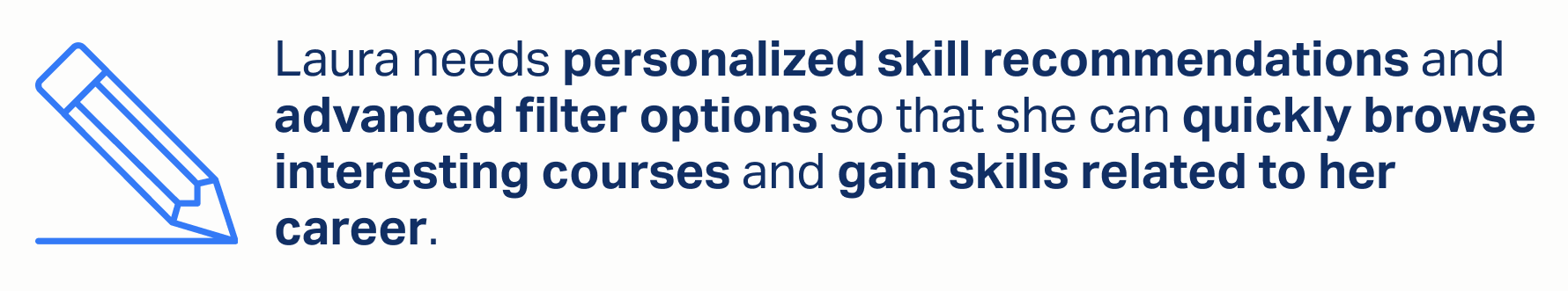
This problem statement focuses on Laura’s main pain points and why she needs a solution to them. To come up with design solutions to this problem, I asked a series of questions to begin brainstorming.
How might we provide personalized classes and courses for Laura?
How might we improve and streamline the search experience for Laura?
How might we assure Laura that a class will fit her schedule?
We will use these questions to help inspire our features. In order to firmly decide what to design, I wanted to explore the competitive landscape to see what other companies are doing—in the education space and the personalization space.
Competitive Research
Since we are working on developing a new feature and redesigning an existing one, we decided that an inventory or feature analysis of competitors would help us understand what Coursera was missing (or what could be improved). I focused on features that involved filtering, searching, and personalization since those are the key elements of our problem statement.
The brands we picked as key competitors to Coursera were Udemy, LinkedIn Learning, and Skillshare—all offer asynchronous, online learning opportunities in a breadth of fields with ranging prices.

We see that by not having recommended categories, Coursera is lacking in terms of personalization. Additionally, even though they all offered filtering, they varied in degree of effectiveness. Udemy and LinkedIn, for example, offered much more robust filtering options—compared to Coursera which only allows filtering by level (beginner, intermediate, mixed) and “Learning Product” (the type of certification offered).
Since personalization is the feature completely new to Coursera, we also wanted to look at comparator businesses that excelled in suggestions and personalizations. We picked Netflix, Headspace, and YouTube since they all are known for providing personalized content to their users based on preferences or viewing history.
We then conducted pluses and deltas to see what features we loved about those products and would want to implement ourselves (as well as the features, or lack of features, to avoid). Here is what we found:

We can see that the key features of our comparators involve an onboarding process to begin customization immediately as well as personalization based on your previous history and interactions with the product (such as video viewing history).
With all this research underway, we’re able to proceed into designing our features.
Design
Based on the analysis of our competitors and thinking about what our Persona, Laura, needs, we came up with two separate design decisions.
For the feature redesign, we focused on the filter function within the Coursera mobile app. As it stands, the filter only allows options for difficulty level, certification offering, and language. Based on our user research and persona, we know that additional tags such as course duration or pricing would help our users quickly find courses on the go.
For the new feature, we are developing a short onboarding process to allow personalization. The onboarding will then provide customized recommendations to our users when searching and browsing courses based on their interests. This will speed up the decision process of users and lead to a higher conversion rate funneled from the mobile app.
To better visualize our ideas, we developed a user flow for each feature to see what the task journey would look like for Laura.
User Flows
The first flow we created is based on the task of creating an account and setting up personalization options. In this flow example, there are just a few options for subjects and program types, but when we build the feature we will implement more. Here it is!
Flow #1: Account Creation and Personalization

We created an additional user flow highlighting the improved filter function we plan on implementing.
Flow #2: Searching for Courses with Filters

This flow focuses on improving the number of filter options within the app. We also noticed that in the current app, there is no way to remove filters or even view your current filters from the results page—another feature we’d want to improve.
With the user flows complete, the team began designing in earnest. While our designer put the wireframes together, I began planning and scheduling usability testing to be ready for testing our prototype.
Mid-Fidelity Wireframes

Wireframes showing the personalization options after signing up for an account.

Wireframes showing the improved filtering options, including completion time and a sorting feature.
First Prototype
Our designer turned these wireframes into our first prototype, seen below. With a workable version of our new features, we were ready to begin testing! If you want to play with the prototype yourself, have at it.
Usability Tests
To improve our design, we conducted usability testing to measure the effectiveness of our designs and get some qualitative insights on the features. I created two tasks for the testing that would allow the users to test the flows of our new features:
Please create an account and personalize your profile for someone interested in 3D design, trading, and programming who wants free courses.
Please search for science classes that you can complete in under 1 month, sorted by rating.
I conducted the testing virtually over Zoom while the users shared their screens so I could track their clicks and how they navigated the frames. We established some goals so we could accurately measure the performance of our users:
Users can successfully complete the task with 0-1 errors in under 2 minutes.
Standout quotes:

Test Results for Task #1:

Thankfully, all users successfully completed the first task of setting up personalization well under the allotted time of two minutes.
There were also zero misclicks across the six users, further showing how effective the platform was for the users.
Test Results for Task #2:

While all users successfully completed task #2 well under the allotted time, there were 7 misclicks across our users. These mistakes came from users trying to click on a “science” bubble that appears during the search function but as not yet activated in our prototype. This was an addition we made to see if users would want to utilize suggested searches rather than type out their queries.
Through verbal and qualitative feedback, we discovered users had a hard time finding the sorting features since they were hidden within the filter menu. Here’s a look at those specific pain points:

With this feedback in, we went on to create high-fidelity prototype.
High-Fidelity Prototype

In our finished prototype, we enabled the science search function so users could easily click on recommended subjects. We also made a clear separation of the sorting features from the filtering to make it clear what options correlated to what. We improved the positioning and clarity of the filter button itself to hover in the screen, using both the filter iconography and copy to indicate the feature. Finally, we now allow users to view their selected filters at the top of the screen and the users can manually remove the filters from the results page one at a time without having to reopen the filter menu.
Final Thoughts
We recommended a continual look into the personalization and customization features for the users and begin testing customization options with real options within the app.
Given the time, we would conduct more research on users who use the learning functions of the Coursera app to find potential improvements in the way notes carry over to the app and how users might be able to learn better on the go—like our good friend (and persona) Laura.
Thanks for taking the time to read my work! Have questions? Reach out!